So it is pretty obvious that the Watchmen and Whatmen novels have similar art but there are a few distinct differences and changes between the two that are worth noting.
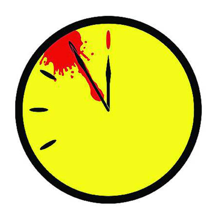
The first and also the most noticeable difference between the two is the Comedians symbol. In the Watchmen novel, it is a regular smiley-face pin with blood splatter. The purpose of this symbol is to reflect the doomsday clock, in the picture below the smiley face is actually facing forward and not twisted like some of the images in the text.This gives a good representation of how the doomsday clock and Comedians symbol are alike.

http://www.oururbanodyssey.com/wp-content/uploads/2009/05/watchers.jpeg

This is much different than the Comedians symbol in Whatmen which
instead of being a pin, it is a bar of soap with no blood splatter. This removes the connection to the doomsday clock as well as altering the entire opening scene. Instead of the detectives discovering that it was in fact a murder, the officers in Whatmen think that he fell out of the shower because he slipped on the soap which causes him to go crashing through the window and it was ultimately just a mistake.
The Whatmen takes scenes from the Watchmen and changes them subtlely to add humor as well as the text being added or altered. A great representation of this is seen at the Comedians funeral, I am sure that you will be able to tell the difference between the two but the origional Watchmen frame is on the bottom and the adapted Whatment frame is on the top.


Notice the similarities and differences between the two frames, realize the difference in the position of people and the shading. The three most obvious differences between the two are most noticeably that Dr. Manhattan is fully dressed in one, but is only wearing a bow tie and cuffs in the other. In the original Watchmen frame, Rorschach is actually hidden and can barely be seen to the right of Daniel but in the Whatmen frame, he is unmasked and very visible behind Adrian. The last change is clearly for subtle humor because the people to the right of the frame are actually the X-Men which is a Marvel comic the main competitor to DC. These subtle changes are not only to add humor to the comic but also to poke fun of character identities found throughout Watchmen. Such as Rorschach always being very stealthy and protecting his identity or the fact that as Dr. Manhattan starts losing touch with humanity, he starts losing his clothes.
Since the Whatmen is a very condensed parody of the Watchmen, some subplots are left out and others are compressed into a few frames. A large subtext of Watchmen was the story of the Black Freighter, this helped give plot guidelines as well as foreshadowing for what is to come. If you have read Watchmen you know that there are many pages full of the frames of the Black Freighter; I would guess somewhere around 20 or so. Interestingly enough, the Whatmen condense this monster of a subtext into 3 frames.

Although it is very brief and leaves our the core details which make it to become such a large part of the Watchmen I think that it holds the same theme that the original Black Freighter followed. The nice part about this text in comparison to the Black Freighter is that there is an explanation of the subtext but in the actual Black Freighter, all of the themes must be interpreted through a thorough reading of the text or in most cases, several readings.
It can be said with confidence that there are many differences in the art and the overall feel of the Whatmen and the Watchmen. Although there are clear differences and many changes to the plot and the characters, the core theme of the novels are the same, that is of course the adaption to vigilantes in society; will they maintain peace and serenity or will they lead us to our own demise? In the end it is completely up to the reader.